Solar Roadways GIS Thought Experiment

Disclaimer: this is not meant to be a thorough analysis — rather, an exploration of an interesting concept using back-of-the-envelope calculations.  Additional investigations using the same (or more recent) data are encouraged, as is criticism.  And if anyone can find a location online with digitized parking lots, please let the lady know? The internet seems to have a dearth of ’em.

A lot of fuss has been caused recently by the Indiegogo Solar Roadways campaign.  People seem to have a great many Feelings for and against, but few commentators seem to be crunching any numbers.  Just how feasible could this idea be, for a relatively small community?

For this analysis, I’ll be using open-source parking lot and road shapefiles provided by the city of Bloomington, Indiana.  Surface area polygons for the former were created by using Feature to Polygon in ArcGIS’s Data Management toolbox; the latter by creating buffer zones of ~3 meters around road center lines.  Neither are perfect measurements, and neither are intended to be.

Map of Monroe county, Bloomington

Size of central Monroe county: 86.3 square miles
Surface area of parking lots: 6.11 square miles
Surface area of roadways: 2.5438 square miles
Number of households in Bloomington (2012 US census):  31,425
Average energy consumption of a household, 2012: 10,837 kWh per year
Annual energy requirements for Bloomington: 34,0552,725 kWh

Using this thing, with metrics from the Kyocera – KD-205GX-LP (which operates at 14% efficiency), in Bloomington, IN, a solar panel measuring a single square foot would be expected to glean 0.2 kWh per year.

SolarCalculator

1 square mile = 27,878,400 square feet
8.6538 miles  (from above calculations) = 241,254,098 square feet…

…which gives us a (rough) estimate of 48,250,819.6 kWh per year.  This more than covers the yearly requirements calculated before for Bloomington.

Of course, this isn’t taking into account the actual efficiency of Solar Roadways, rural households living outside of Bloomington, energy loss in transportation, [insert laundry list of items here], but it is interesting to think about.  Though large cities would have difficulty obtaining enough surface area for all their citizens, small communities could benefit greatly from the implementation of a program like Solar Roadways.


Donate to your local community college.

Stealing from a grad student friend at CalTech:

“Offended by rising college tuition costs? Pissed that Rice’s tuition has nearly doubled over 10 years? Or whichever university you graduated from that seems to be charging an arm and a leg?

Here’s an idea: instead of writing a donation check to your expensive alma-mater, write it to your local community college instead. They are institutions committed to providing a low-cost education, but they generally don’t see the sort of money that gets donated to four-year institutions, though I’d argue that they need it far more. In California, the situation is incredibly borked and local CCs have massive wait-lists for eager students.

[…My university] gave me so much, but I’d rather see my donations go to a school that keeps accessibility as one of their major goals.”

Absolutely in favor of donating to community colleges. They’re valuable resources for training a much-needed technical work force, and offer reasonable prices for most first-year college courses. They also provide excellent opportunities for students to find out what they *want* to study — without paying exorbitant prices at a four-year university. Definitely enjoyed everything I took from Houston Community College and Hill College. Both will be seeing a donation this year.

Everyone else on the internet is getting angry, so why not?

I feel awkward speaking toward the fiery PG comment wars specifically, because I’m friends with a few of the folks involved.  I also know a few people who lead women’s coding groups, and don’t want to detract from those initiatives.

Will say, however: whoever starts a women’s coding group should be certain that they’re doing it for the correct reasons. They should be inclusive of all genders / races / what-have-you; accepting, encouraging, and equipped to deal with a variety of experience levels; have a set, valuable curriculum; and try their best to make everyone feel welcome. The creator and the instructors’ primary motivations should also *not* be personal gain. This is the only way to provide a proper learning environment.

PyLadies Austin does this well, as do several branches of Girl Develop It.

I’ve been to a few “women’s coding events” where the vast majority of the instructors were male (think 90%) — men who spoke patronizingly to both the students and to the female instructors, and who seemed much more interested in appearing knowledgeable (or finding a girlfriend) than actually teaching.  Those events reinforce negative stereotypes, waste everyone’s time, and are toxic for all folks involved.  Again:  I’m not saying that every event is this way — most do their damnedest to have diverse representation, and go out of their way to make sure everyone is comfortable.  But there are a few groups who should sincerely question their motivations.

In the end, the best things you can do to raise the numbers of women in STEM fields are:  show ladies the cool things that can be accomplished with engineering / programming / science, hope they get inspired, and expose them to a variety of positive female role models (because they DO exist, and ARE badass).  So, uh:  what you would do to get anyone inspired in a particular field.

If you’d like examples of positive female role models in tech, Raquel Velez is one, as are Angelina Fabbro and Sara Chipps and C.J. Silverio — just to name a few.  Ask me if you’d like to see more.  (Pretty sure that John Resig made a list, even, a few months ago.)

tl;dr
Be respectful, be passionate, be vocal, encourage others to be the same.

Why I hate ArcGIS

Guys, why do corporations seem to have such a hard-on for ArcGIS?  Invariably, if a map needs to be created, or if a member of my team needs to georeference an image, the go-to software is something provided by Esri.  Rationale?  Speed. Ease. Pretty…ish (and emphasis on the “ish”). They’ve got a market on .gdb files (though there are a few workarounds to explore within QuantumGIS, and increased functionality in its newest release, 2.0 Dufour).  Direct connects to databases (ArcCatalog), which is useful when a variety of applications must be integrated.

Problems, though:

  • Shitty JavaScript API documentation. (And less-than-ideal Python documentation, though much better than the docs for Quantum GIS.)  The future of map-making will revolve around user interfaces, speed, customization, accuracy, and the ability to convey a data-intensive story spatially.  How do you expect that to happen without incorporating JS, Python, or [insert language of choice]?  My money’s on JS — or ClojureScript, if we can build the community for it.  Related.
  • EXPENSIVE ($1,500 a seat for a basic commercial license!).  It’s difficult to justify that pricetag for a small business, a local government, or the generic user.  Did I also mention that $1,500/seat doesn’t cover much of ArcGIS’s functionality?  And also doesn’t include the hefty prices that folks fork over for data?  Or classes that they might need to take to learn how to use the software? Because:
  • Overly complex Bad, just fucking bad user interface.  Why does this look like a Windows 95 application?
  • Monopolization of the market. What’s ArcDesktop’s incentive for fixing any of the issues they have currently?  Who’s Esri’s major contender? If they have a contender, why haven’t I heard of them? Who’s doing [viable contender’s] marketing?
  • Have you seen much of a step change with the latest versions? Because I sure haven’t.
  • WHY IS IT STILL CRASHING

And in case that wasn’t quite clear enough:

Don’t get me wrong. I still (preferentially) use Esri products.  If I need spatial data — anything relying on accurate CRS / projections — I create it in Arc and ship it over to an application in the Linux environment.  GeoTIFF’s? Arc all the way.  Arc also has the largest — and most international user community.  But much of my preference is due to having the luxury of a corporate license — and for personal use, there’s little reason to justify the pricetag.

Also, Esri?  Your maps aren’t all that beautiful, in comparison with MapBox, with LeafletJS, or even with GoogleMaps.  Step up your game. Because when these guys incorporate user-specific data into their visualizations (and MapBox is already doing this, FYI), you’ll be obsolete.

Shameless plug:  If y’all haven’t checked out QGIS in the past several years, definitely look into it again.   Can’t say enough good things about the progress it’s made.

Houston 3-1-1 Data : Initial Impressions

The city of Houston recently launched the Open Houston 3-1-1 Data Challenge: a month-long “civic hacking” event where teams and individuals can pair with the city of Houston to develop applications and data visualizations that make practical use of the City of Houston’s 3-1-1 data.

…And what is 3-1-1 data, you may ask?

3-1-1 is a central, non-emergency telephone number that provides quick municipal services in many communities throughout Canada and the United States.  When a citizen calls in via 3-1-1, their request is logged in a database, and tracked until it reaches completion.  General rule of thumb for calling in: “Burning building? Call 9-1-1. Burning question or request? Call 3-1-1.”

In large cities, such as Houston, the number of calls is astronomical — for example, in just the past month, our city has had over 20,000 unique 3-1-1 reports!

Imagine the value of this data for politicians, for real estate agents, and for concerned citizens:  if you’d like to purchase a home, you probably want to ensure that it’s in an area where pipelines aren’t leaking, where stray animals aren’t running rampant, and where there are few reports of vagrants and noise complaints;  if you’re a politician, you probably want to know about the problems concerning your constituents;  If you’re a citizen, you want to ensure that the broken fire hydrant on your block will be fixed in a timely manner; etc.  Potential insight into public issues is endless, and it’s for this reason that sites like Open311 have been launched.

A (very) preliminary look at last month’s Houston 3-1-1 data shows:

Image

Districts C and D seem to have the largest percentage of calls, by far, even though each of the eleven districts represent just under 10% of the Houston populace (2010 census data) and cover similar land areas:

Percentage of Houston population by district (2010)

Percentage of Houston population by district (2010)

* * * * *

Houston City Council districts

Houston City Council districts

There also seems to be a trend in service requests finished early and late, by department — not to mention some obviously erroneous data.  Somehow it doesn’t seem likely that 20% of tasks could be completed 180 days ahead of schedule…

Major challenges are going to be data clean-up and attempting to extract meaning from the large amount of information we have currently, in addition to the thousands of entries streaming in each night.  Also excited to start playing with the METRO public transportation and hydrology .shp files available via the Code for Houston website.

* * * * * * * * * *

METHODOLOGY:

  • Downloaded the current month‘s 3-1-1 data, saved as 311-Public-Data-Extract-monthly-clean.txt
  • awk-ed out the DISTRICTS column, saved as 311_districts.txt (see one-liner below)
  • short and messy matplotlib pie chart (see script below)

== AWK ONE-LINER ==
awk -F"|" '{print $4}' 311-Public-Data-Extract-monthly-clean.txt > 311_districts.txt

== PIE CHART ==
#! /usr/bin/python

from pylab import *
import collections
import re

words = re.findall(r'\w+', open('311_districts.txt').read().lower())
tally = collections.Counter(words).most_common(len(collections.Counter(words)))

figure(1, figsize=(8,8))
ax = axes([0.1, 0.1, 0.8, 0.8])

labels = []
fracs = []

for i in tally:

labels.append(i[0])

fracs.append(i[1])

explode = (0, 0.5, 0, 0, 0, 0, 0, 0, 0, 0, 0, 0, 0)

pie(fracs, explode=explode, labels=labels, colors = ['b', 'y', 'g', 'b', 'w', 'r', 'y', 'g', 'b', 'w', 'r', 'y', 'g'], autopct = '%1.1f%%', shadow=True)

title('311 data percentages, via district', bbox={'facecolor':'0.8', 'pad':8})

show()

“They don’t learn by understanding, they learn by some other way — by rote or something. Their knowledge is so fragile!”

(Definitely guilty of everything described.)

* * * * * * * * * * * * * *

(...this, too.)

RESOLVED:

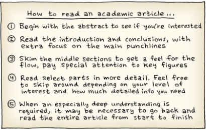
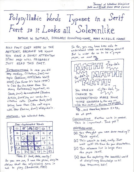
  • Journal articles are intended to convey information. They shouldn’t have to be systematically attacked and interpreted (…then reinterpreted) by the reader.
  • Abstracts and conclusions are less text-intensive than the body of the article, but are likely to be just as incoherent (less-structured, offering fewer figures).  Overall, this detracts from their use.
  • Images and figures should be the primary conveyors of information in any article. Terse prose is okay, and even encouraged, if meaning can be adequately conveyed with images.

I’m a huge fan of Bret Victor, particularly his paper “Scientific Communication as Sequential Art” (which is detailed in the first part of a lecture he did for the MIT Media Lab, “Media for Thinking the Unthinkable“).  In it, Victor redesigns a scientific paper as a series of captioned, dynamic illustrations within a comic-like format. The general meaning of the paper is preserved, and the reader is more likely to understand the presented concepts.  So, question: why hasn’t this been done for more journal articles, and for e-textbooks? Other question: why don’t we have textbooks specifically designed for digital reading?

Wolfram’s Demonstrations Project launched an attempt (sort of), presenting embeddable figures in a computable document format.  The CDF documents are free to create within Mathematica, and viewable by anyone who downloads the CDF player; however, there is little likelihood that the software’s code will be open-source — Mathematica (the tool for creating the documents) certainly isn’t — and I’m not aware of any projects working to create an alternative.  More complaints:  the Wolfram demonstrations project just focuses on visual representation of equations, and direct manipulation, but not on physical concepts and meaning.  Lots of pretty pictures, little understanding.

Physics, mathematics, biology, finance, and statistics are all obvious arenas for change in values over time — and all are heavily represented on Wolfram’s site.  There are even examples in the social sciences, in investment planning, and in journalism!  It’s troubling to see the earth sciences, astronomy, and materials science so under-represented, though — and especially troubling to see that the visualizations are being used on a small scale (i.e., one or two per page of obfuscated text, sans explanation).  Nothing akin to the sequential, related images and understandable prose in Victor’s presentation.

Speaking to what I know best: Geology is certainly an area where physical changes can (and should!) be dynamically and visually represented.  Descriptions of lithologies are inadequate; and, as helpful as large scale geologic maps and cross-sections happen to be, they would be infinitely more understandable if dynamically represented.  Can you imagine seeing a cross-section as its layers are deposited and subsequently deformed, over time?  With mouse-overs detailing properties of lithology, prospective stresses and strains, changes in porosities and permeabilities as strata are buried and undergo pressure?  Now imagine seeing that in three dimensions — and being able to scroll through the cross-sections in space, and in time.  Badass.

A scientist is only as good as her tools; and right now, the scientific community’s primary tool for communication is a low-bandwidth, almost incomprehensible, static page.  We can and must do better.

If you know of any software that speaks to these issues — preferably open-source software — please let me know!  I’d love to learn more about it, and to use it.

* * * * * * * * *

PS, for those who would be interested: purposefully not mentioning hyrdrogeology (i.e., the inadequacies of MODFLOW). That’s a whole ‘nother can of worms, for a whole ‘nother blog post.  (It hasn’t been modified in ages! The user-interface is terrible! Hydrologic visualization is terrible! Get off my lawn!)

“…so, how willing would you be to learn ClojureScript?”

Of course!  It’s not like I have a life, right?
But let’s start with Clojure, shall we?  No reason to get ahead of ourselves.

OReilly.Clojure.Programming.(2012)

10:42 pm
“Clojure demands that you raise your game, and pays you back for doing so.”
What the hell is this, high school football?

10:46pm

  • Hosted on the JVM
    Yes, libraries.
    Ridiculously quantities of libraries.
    Fucking hate Java, though.
  • Lisp-y
    (((((((((  ))))))) !!!!! ??? !!!
    Thanks, Wayne Coyne.
    …But I guess that means macros and late-binding?
  • Functional
    …okay, yes, immutable data structures are good
  • Dynamic and strongly-typed
    Wait. Like Python? Now I’m paying attention.  But I thought you said it was speedy, as well? How is that even possible? Tell me more about that bit, what is this magic
  • Concurrency and parallelization“Clojure’s reference types enforce a clean separation of state and identity, providing defined concurrency semantics that are to manual locking and threading strategies what garbage collection is to manual memory management.”  …Go on.

11:12 pm

Why do you keep telling me to download things from websites like I can’t
sudo apt-get install


11:58 pm
Where the hell is Rich Hickey

Here there be dragons.

Executive summary:
Stop what you’re doing and go sign up for a hackathon right now. 

No programming experience? Doesn’t matter.
No interest in technology? Lies. Why else would you be reading this?
No time? Make time.

If we’re talking knowledge gain per hour, this was by far the most educational experience of my life.  Trust me.  Just try.  You won’t regret it.

– – – – – – – – – – – – – – – – – – – – – – – – –
Now that that’s out of the way:
– – – – – – – – – – – – – – – – – – – – – – – – –

Intro
Plans for Saturday were to attend Houston TechFest and a mysterious (…and apparently manga-themed?) event in Round Rock called “BattleHack“.  I’d heard about the latter from Austin’s PyLadies list-serv, and teamed up with two PyLadies-ATX members I’d met at a Rackspace information session earlier in September.  Though neither Jess, Christine, or I were professional Python developers, we thought it would be fun to create (or attempt to create!) an application over the weekend.

I. 
Thoughts on Houston TechFest
Two SharePoint tracks, two ASP.NET tracks, and only one JavaScript track.
The venue had no internet.

… …
… …. …
Moving on.

II.
Let me tell you some things about TechShop – Austin/Round Rock.
That place is fucking magic;  absolutely a playground for anyone interested in creating.  Textiles, woodworking, 3D-printing, electrical engineering, furniture-making, metallurgy:  you name it, they’ve got it! And, moreover, they have a user community ready and willing to write instructables or form hobbyist groups.

Additional bonus:  TechShop’s employees are passionate about what they do, and it shows.  How many other businesses can you name have workers who happily stay awake (and working — on parts for a motorcycle, or a chakram for a silly blonde girl, or custom cases for Raspberry Pi) from 5:00pm – 8:00am?  And then come back from 11:30am – 4:00pm and do it all over again?  It’s a ridiculously beautiful and inspiring thing to see people who love their jobs that much.

III.
But this is supposed to be about, like, programming.  Right?
I’m getting to it, sheesh.

The rules for the event were simple:  form teams (or work alone), use the PayPal API, create a solution to benefit your community, don’t blow anything up, etc.  Platform, language, and solution were all open to creativity.  First 50 people to show up got a Raspberry Pi; free food and caffeine throughout the day; locked in the building at night.

So let me just make this clear:  I was locked in heaven with awesome (free) toys, cool people, breakfast tacos, never-ending caffeine, and piles of meat.

Life is hard, yo.  Did I mention there was beer, too?

IV.
Our project
We’d decided to create a crowd-funding site for non-profits that provided transparency and accountability, with a gamification factor (to keep things interesting, and to allow for nifty dragon avatars).  Flask, Gadfly, SendGrid, Twilio, ServeQuake, and Bootstrap were all incorporated — none of which we had used before.  I’ll be writing an additional blog entry with code samples (and a run-down of the other groups’ projects) later on in the week.

Our result, 24 hours later: Trust in Dragons.

V.
“Wait, what? We won?!”
That’s right, folks:  we won third place, Sphero balls, fame, glory, and a heck of a lot of satisfaction.  Personally?  I’ve never had so much fun, or learned so much, in such a short period of time.  Will definitely be signing up for more hackathons, working with the team to develop our site, and… heading back to TechShop for a welding class or two.

Epilogue
The point:
If we can do it, you can, too.
Please do, actually.  And please tell me all about it.